Behance Project Description Option 1: Luxury & Elegance (Focus on "Velvet Skin")
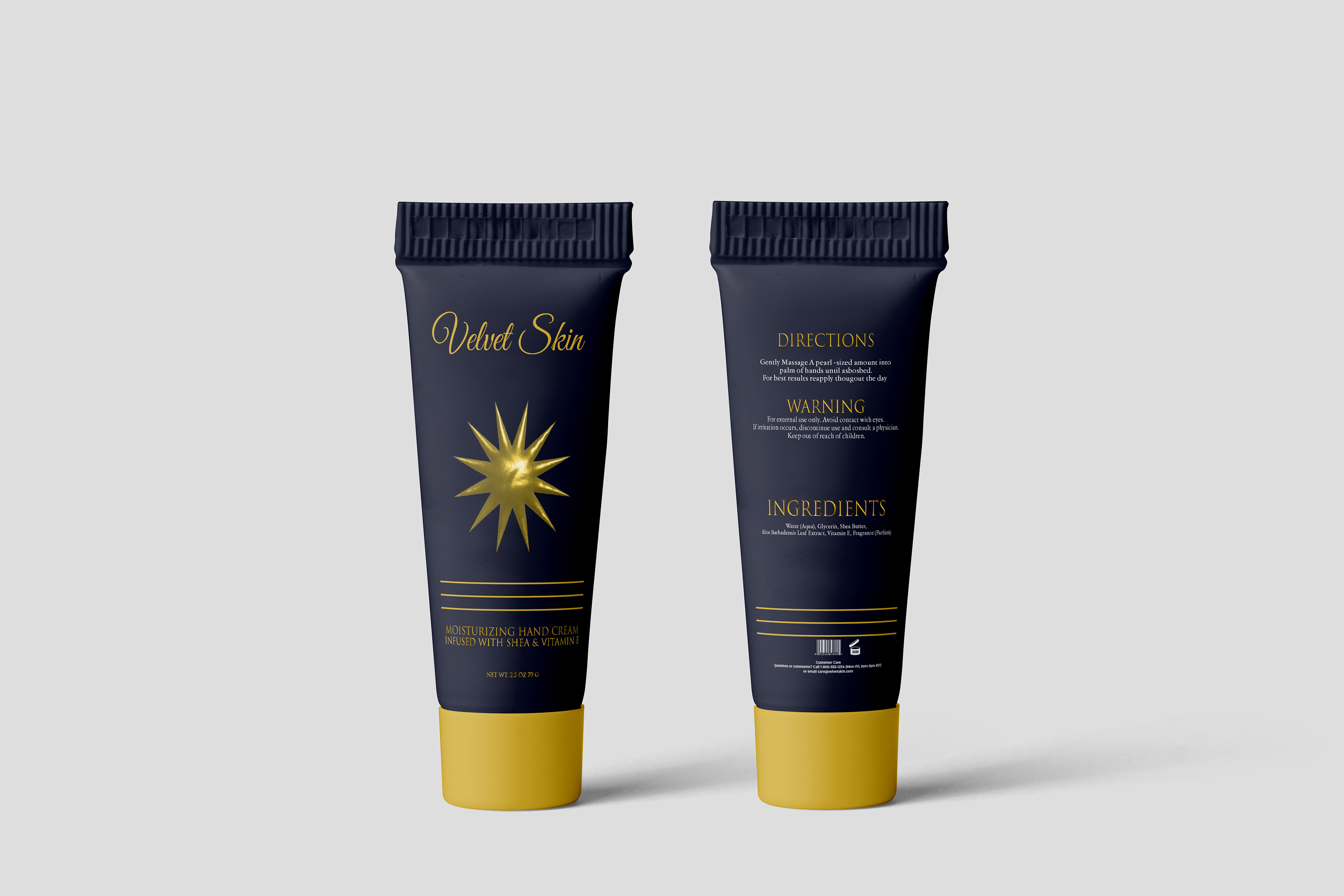
Project Title: Velvet Skin – Packaging Design for a Luxurious Hand Elixir
The Challenge: Elevating Self-Care to a Ritual
The goal was to create a packaging design for a premium hand cream that speaks to indulgence, luxury, and quality. "Velvet Skin" isn't just a cream; it's an experience—a necessary ritual of self-care. The design needed to stand out on a high-end shelf, appealing to a discerning customer who values quality and aesthetic.
The Solution: Dark, Dramatic, and Decadent
We opted for a rich, matte navy blue as the base color, providing a sophisticated, tactile feel that lives up to the "Velvet Skin" name. This dramatic canvas is juxtaposed with brilliant gold foil accents to instantly communicate premium status and luxury.
Color Palette: Matte Navy Blue and Brilliant Gold.
Typography: A combination of an elegant, flowing script font for the brand name ("Velvet Skin") and a clean, serif typeface for product details, ensuring readability while maintaining a classic, high-end look.
Key Visual: The central exploding gold star/sunburst icon serves as a bold, aspirational focal point, symbolizing radiant skin and high-quality ingredients.
Form Factor: A sleek, minimal tube shape with a striking gold cap and base anchors the design, creating a visual weight that feels substantial and expensive in the hand.
The resulting design is an unapologetic statement piece—a piece of counter-worthy art that encourages a moment of luxurious pause.
Behance Project Description Option 2: Clean & Trustworthy (Focus on "Everyday Care")
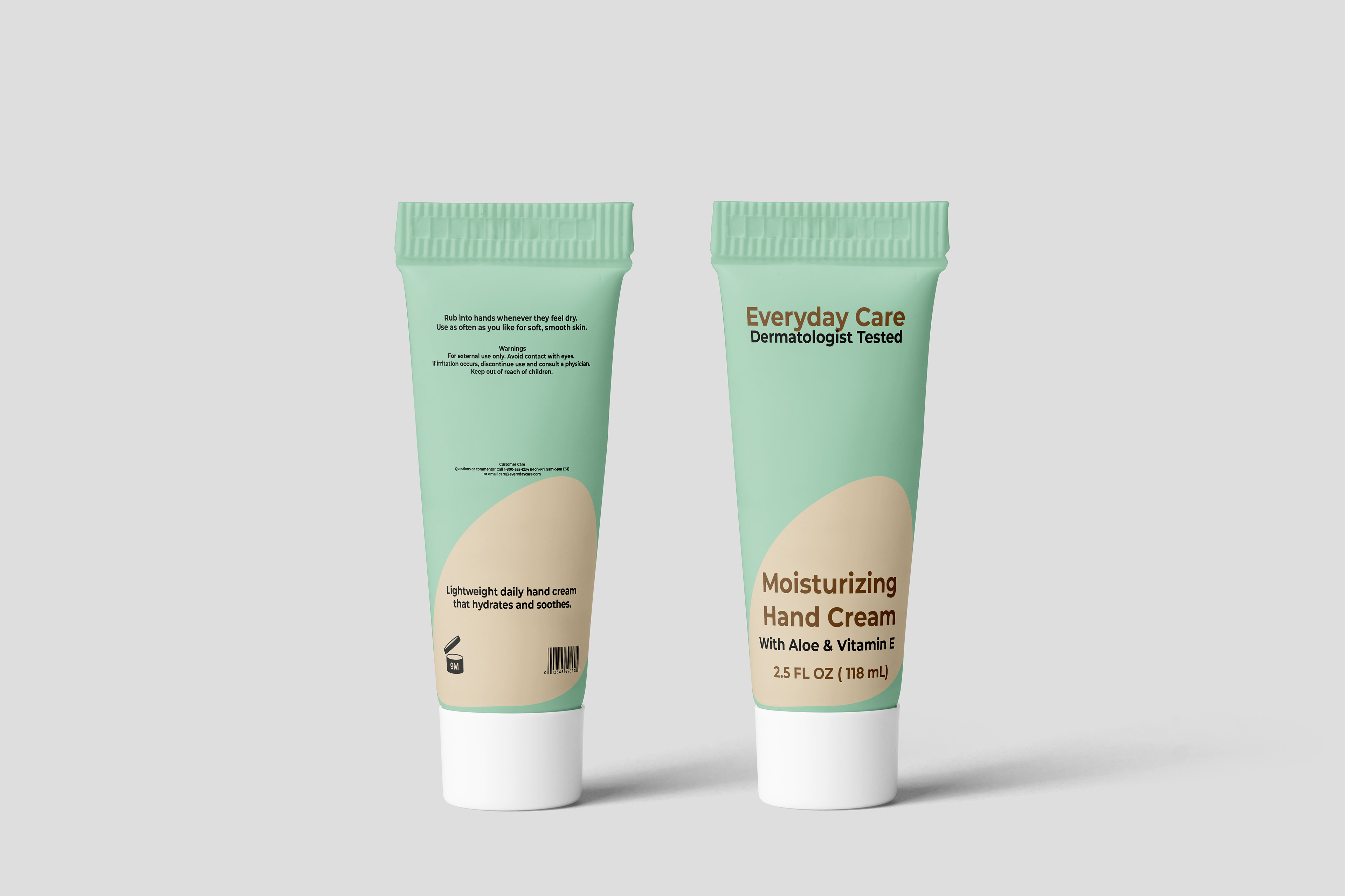
Project Title: Everyday Care – Refreshing and Trustworthy Hand Cream Packaging
The Challenge: Creating an Approachable Daily Essential
In a saturated market, we needed to design a hand cream package that communicates immediate trust, efficacy, and everyday usability. The brand, "Everyday Care," focuses on simple, reliable products for the whole family. The design had to feel lightweight, refreshing, and clearly highlight its skin-loving ingredients like Aloe & Vitamin E.
The Solution: A Breath of Fresh Air
We moved away from overly complicated or clinical aesthetics and opted for a design that feels gentle and naturally derived. The core of the design is a soothing, muted palette and clear, balanced layout.
Color Palette: A calming base of soft mint green paired with a neutral, grounding tan/off-white. This palette evokes a sense of freshness, hydration, and natural ingredients.
Typography: We utilized a clean, modern, and easily readable sans-serif font throughout. This choice underscores the product's Dermatologist Tested claim, suggesting transparency and reliability.
Key Design Element: The curving color block on the back of the tube breaks up the space, providing visual interest and a subtle organic feel, reminiscent of the soothing properties of the cream.
Messaging: The most important claims (Dermatologist Tested, Lightweight daily hand cream, With Aloe & Vitamin E) are positioned prominently on the front for quick consumer comprehension.